As I previously mentioned on the challenge thread there is still a chunk of things I'm planning to add to the scene to improve it further before I add it to my portfolio. Below is the scene as it currently stands:
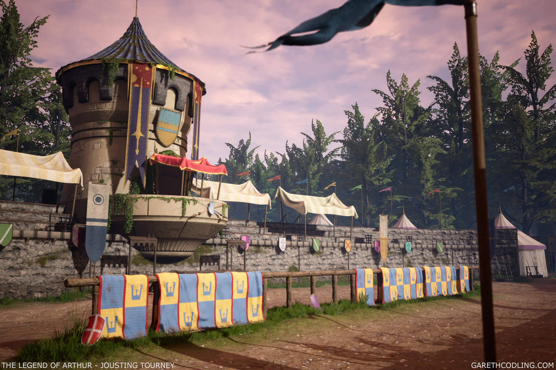
I'll be documenting on here when I make additions to the project over the next few weeks with the hopes of having it portfolio ready by the end of August. I want to focus on pushing the value ranges in the scene first before I add the other parts. One thing that the concept does is push lighter values in the sky and in the ground to highlight the seating and tower as the main focus of the image. My current values in the image need some tweaks to push this more in my final composition.


Areas of note:
- Dark values on drapes and large flags need lightening (Flag needs to be lighter than the corbels and the stripes on the drapes need to be a similar value to the blue)
- Ground needs a lighter value range. I'm planning on revisiting the textures for the ground to add more variation as well so I will consider value further when editing the materials.
- Trees are quite dark overall at the moment and need a lighter value across them (Tweaking the leaf textures should help as well as adding some elevation behind the initial row of trees so that trees further back are affected by the fog in the scene.)
- Sandstone may also benefit from being lighter in value to further highlight this area in the composition.
As a further note I'm going to focus more on a cinematic shot like the one above as well as the original concept angle. I've so far: altered the lighting setup, added a slight world aligned variation to the seating materials albedo and roughness, and altered some of the colour values on the canopies.
Looking forward to really nailing this scene down so it's portfolio ready! Any feedback is always welcome! 😁